
Salesforce Reports and Dashboards: A Complete Guide to Data Analysis and Business Insights
Businesses generate a huge amount of data every day. From customer information and sales opportunities to leads, accounts, activities, products, and service interactions, organisations need an effective way to understand all this information and turn it into meaningful business insights.
This is where **Salesforce Reports and Dashboards** become extremely valuable.
Salesforce provides powerful reporting and analytics capabilities that allow users to collect, filter, group, summarise, and visualise CRM data. Instead of manually going through hundreds or thousands of records, users can create reports that display exactly the information they need. Dashboards can then transform that information into charts, graphs, tables, and metrics that make business performance easier to understand.
Salesforce itself describes reports as collections of data that can be filtered, grouped, and analysed, while dashboards provide a visual representation of data around a common business theme.
For Salesforce Administrators, Developers, Consultants, Business Analysts, and sales professionals, understanding Reports and Dashboards is therefore an important Salesforce skill.
## What Are Salesforce Reports?
A Salesforce Report is a collection of records that meet specific criteria.
For example, a company may want to know:
* How many leads were created this month?
* Which opportunities are currently open?
* Which sales representatives have the highest revenue?
* How many opportunities were closed successfully?
* Which accounts generated the most business?
* How many cases remain unresolved?
* What is the total value of the current sales pipeline?
Instead of searching for each record individually, users can create a report that automatically retrieves the required information.
A report can contain fields, filters, groupings, summaries, charts, and other information depending on the business requirement.
Salesforce’s Report Builder provides tools for selecting fields, applying filters, organising data, and creating summaries or visualisations.
## Why Are Salesforce Reports Important?
Salesforce stores valuable business information, but simply storing data isn’t enough.
The real value comes from being able to analyse that data.
For example, suppose a company has 10,000 opportunity records. Looking at those records individually would make it difficult for management to understand overall sales performance.
A report can answer questions such as:
**What is the total opportunity value?**
**How many opportunities are in each stage?**
**Which sales representative owns the most opportunities?**
**Which opportunities are expected to close soon?**
This turns raw CRM records into useful information.
Salesforce reports can therefore help organisations make more informed, data-driven decisions rather than relying entirely on assumptions or manually prepared spreadsheets.
## Types of Salesforce Reports
Salesforce provides different report formats for different business requirements.
### 1. Tabular Reports
A tabular report displays data in rows and columns, similar to a spreadsheet.
It is useful when users simply need a list of records.
For example:
* List of leads
* List of accounts
* List of contacts
* List of opportunities
* List of cases
A sales representative could create a tabular report showing all open opportunities assigned to them.
Tabular reports are straightforward and useful when detailed record information is more important than calculations or visual analysis.
### 2. Summary Reports
Summary reports allow users to group data and display subtotals.
For example, a company could create a report that groups opportunities according to sales representative.
The report could show:
**Sales Representative → Number of Opportunities → Total Opportunity Amount**
This makes summary reports useful for analysing performance across different groups.
### 3. Matrix Reports
Matrix reports allow users to group information by both rows and columns.
For example, a company could analyse sales according to:
**Rows:** Sales Representatives
**Columns:** Opportunity Stage
This provides a more detailed view of business performance.
Matrix reports are particularly useful when management wants to compare multiple dimensions of data.
### 4. Joined Reports
Joined reports allow users to combine multiple report blocks into a single report.
For example, a sales manager might want to analyse:
* Opportunities
* Cases
* Activities
* Accounts
within one reporting view.
Joined reports can be useful when different types of information need to be analysed together.
## What Is a Salesforce Report Type?
Before creating a report, users generally select a **Report Type**.
A report type determines which objects and fields are available to the report.
For example, if you select an Accounts report type, Salesforce provides fields related to accounts.
If you select an Opportunities report type, you can work with opportunity-related information.
Report types are important because they determine the data relationships available for reporting.
Salesforce explains that choosing a report type determines the records and fields available when building a report.
## Standard Report Types vs Custom Report Types
Salesforce provides many standard report types.
Examples include reports involving:
* Accounts
* Contacts
* Leads
* Opportunities
* Campaigns
* Cases
* Products
* Activities
However, sometimes standard report types do not provide the exact combination of objects or relationships required by a business.
In such situations, Salesforce Administrators can create **Custom Report Types**.
Custom Report Types provide greater flexibility because administrators can define the objects and relationships available to users when creating reports.
For example, an organisation may require a report involving Accounts and a specific related custom object.
A custom report type can be designed according to that requirement.
## Salesforce Report Filters
Filters are one of the most important features of Salesforce Reports.
A filter allows users to control which records appear in a report.
For example, instead of displaying every opportunity in the organisation, a sales manager might want only:
**Open Opportunities**
or
**Opportunities Closing This Quarter**
or
**Opportunities Owned by a Particular Sales Team**
Filters make reports more focused and useful.
Common filtering requirements include:
* Date ranges
* Record ownership
* Status
* Stage
* Industry
* Region
* Account type
* Lead source
* Amount
* Custom fields
Using appropriate filters is essential because a report containing too much irrelevant information can become difficult to understand.
## Grouping Salesforce Report Data
Grouping allows users to organise records according to a particular field.
For example, an opportunity report can be grouped by:
* Stage
* Industry
* Owner
* Account
* Region
* Close Date
Suppose a company has 500 opportunities.
Instead of displaying all 500 records in one long list, Salesforce can group them according to opportunity stage:
**Prospecting**
**Qualification**
**Proposal**
**Negotiation**
**Closed Won**
**Closed Lost**
This immediately gives management a better understanding of the sales pipeline.
Salesforce’s own Trailhead examples demonstrate grouping opportunity data by fields such as Industry and Stage before using the resulting report as the basis for dashboard visualisations.
## What Is a Salesforce Dashboard?
A **Salesforce Dashboard** is a visual representation of Salesforce data.
While a report primarily provides detailed data, a dashboard presents important information visually through components such as charts, metrics, tables, and graphs.
For example, a Sales Dashboard might display:
* Total Revenue
* Open Opportunities
* Opportunities by Stage
* Monthly Sales
* Win Rate
* Top Sales Representatives
* Leads by Source
This allows executives and managers to understand business performance quickly.
Salesforce describes dashboards as visual displays of data that help users identify trends, understand quantities, and measure the impact of their activities.
## Difference Between Salesforce Reports and Dashboards
Reports and dashboards work together, but they serve different purposes.
### Salesforce Report
A report is primarily used to:
* View detailed data
* Filter records
* Group records
* Summarise information
* Analyse individual records
* Create report-level charts
### Salesforce Dashboard
A dashboard is primarily used to:
* Visualise important information
* Monitor KPIs
* Identify trends
* Compare performance
* Present data to management
* Provide an overview of business performance
In simple terms:
**Report = Detailed Data**
**Dashboard = Visual Business Insight**
Reports provide the underlying information used by dashboard components. Salesforce documentation confirms that dashboards use source reports to provide the data displayed in their widgets or components.
## Salesforce Dashboard Components
A dashboard can contain multiple components.
Depending on the business requirement, users can use visual formats such as:
### Charts
Charts make numerical information easier to understand.
Examples include:
* Bar charts
* Line charts
* Pie charts
* Donut charts
* Funnel charts
For example, a sales team could use a funnel chart to show opportunities moving through different stages.
### Tables
Tables are useful when users need to see specific records along with visual information.
For example, a dashboard could contain a table showing the top 10 opportunities by amount.
### Metrics
A metric component can highlight a single important number.
For example:
**Total Sales: ₹50,00,000**
or
**Open Opportunities: 125**
This is useful for KPIs that management needs to monitor quickly.
### Gauge
A gauge can show progress toward a target.
For example:
**Sales Target: ₹1 Crore**
**Current Sales: ₹75 Lakh**
The visual representation makes it easier to understand progress.
## How Reports and Dashboards Work Together
Reports and dashboards are not separate systems.
They work together.
Consider a company that wants to monitor its sales performance.
First, the Salesforce Administrator creates an Opportunity Report.
The report may contain:
* Opportunity Name
* Account
* Amount
* Stage
* Owner
* Close Date
The administrator then applies appropriate filters and groups the opportunities.
Next, the report can be used as the data source for dashboard components.
The dashboard might display:
**Total Opportunity Value**
**Opportunities by Stage**
**Sales by Representative**
**Monthly Revenue**
**Top Opportunities**
This creates a complete sales analytics solution.
Salesforce’s official documentation notes that a dashboard can contain multiple components, with each component using a source report to provide its data.
## How to Create a Salesforce Report
Creating a report generally follows a straightforward process.
### Step 1: Open Reports
Navigate to the Reports area in Salesforce.
### Step 2: Select New Report
Choose the option to create a new report.
### Step 3: Select a Report Type
Choose the appropriate report type according to the information you want to analyse.
For example:
**Opportunities**
### Step 4: Add Fields
Select the fields that should appear in the report.
### Step 5: Add Filters
Apply filters to display only the required records.
### Step 6: Group the Data
Group records according to useful categories such as Stage, Owner, Industry, or Region.
### Step 7: Add a Chart
If visual analysis is required, add an appropriate chart.
### Step 8: Save and Run
Save the report and run it to review the results.
Salesforce Trailhead follows this general workflow when teaching users how to create reports, including selecting a report type, using filters and grouping, and saving the completed report.
## How to Create a Salesforce Dashboard
After creating useful reports, users can create a dashboard.
### Step 1: Open Dashboards
Navigate to the Dashboards area.
### Step 2: Select New Dashboard
Create a new dashboard and provide a meaningful name.
### Step 3: Add a Component
Select the option to add a dashboard widget or component.
### Step 4: Select the Source Report
Choose the report that contains the required data.
### Step 5: Select the Visualisation
Choose the appropriate chart, table, metric, or other visual representation.
### Step 6: Configure the Component
Add a meaningful title and configure the display settings.
### Step 7: Add More Components
Repeat the process to create a complete dashboard.
### Step 8: Save the Dashboard
Save the dashboard and review the final layout.
Salesforce provides a dashboard builder that allows users to select source reports and configure visual components.
## Salesforce Dashboard Filters
Dashboard filters allow users to view information according to different criteria.
For example, a company may have one Sales Dashboard but want to analyse data according to:
* Region
* Sales team
* Product
* Industry
* Time period
Instead of creating multiple dashboards for every scenario, appropriate filters can make a dashboard more flexible.
This is especially useful for managers who want to change the scope of the information without creating a completely new dashboard.
## Dynamic Dashboards
A particularly useful Salesforce feature is the **Dynamic Dashboard**.
A traditional dashboard can run using a specified user context.
Dynamic dashboards can instead display information according to the logged-in user’s access.
Salesforce explains that with dynamic dashboards, the running user is the logged-in user, meaning viewers see dashboard data according to their own access level. Availability depends on the Salesforce edition.
This can be useful for organisations where different employees should see different information.
For example:
A sales representative should see their own opportunities.
A sales manager should see their team’s opportunities.
A regional manager may need to see information for their region.
Dynamic dashboards can help provide a more personalised view while respecting Salesforce security and access controls.
## Reports and Dashboards for Sales Teams
Sales teams are among the biggest users of Salesforce reporting.
A sales dashboard can help managers monitor:
* Pipeline value
* Closed revenue
* Win rate
* Sales targets
* Opportunity stages
* Lead conversion
* Sales representative performance
* Forecast information
For example, if a sales manager notices that many opportunities remain stuck in the proposal stage, they can investigate the reason.
This makes the dashboard more than just a visual report.
It becomes a tool for identifying business problems.
## Reports and Dashboards for Marketing Teams
Marketing teams can also benefit from Salesforce Reports and Dashboards.
They can analyse:
* Leads generated
* Lead sources
* Campaign performance
* Lead conversion
* Campaign members
* Opportunities influenced by campaigns
A marketing dashboard can help answer an important question:
**Which marketing activities are generating valuable business opportunities?**
This allows marketing teams to make better decisions about where to allocate their resources.
## Reports and Dashboards for Customer Service
Salesforce reporting is not limited to sales and marketing.
Customer service teams can create reports for:
* Open cases
* Closed cases
* Case priority
* Case status
* Resolution time
* Cases by agent
* Cases by product
* Customer issues
A service dashboard can provide managers with a quick overview of support operations.
For example, if the number of high-priority cases suddenly increases, management can identify the issue and take action.
## Best Practices for Salesforce Reports
Creating a report is easy.
Creating a **useful** report requires planning.
### 1. Define the Business Question
Before creating a report, ask:
**What question should this report answer?**
Avoid creating reports simply because the data is available.
### 2. Use Relevant Filters
Too many records can make a report difficult to understand.
Use filters to focus on meaningful information.
### 3. Choose the Right Report Type
The report type determines the available data.
Always select a report type that matches the business requirement.
### 4. Use Meaningful Names
Instead of naming a report:
**Opportunity Report 1**
use a descriptive name such as:
**Open Opportunities Closing This Quarter**
This makes reports easier to find and understand.
### 5. Avoid Unnecessary Fields
Only include fields that provide value.
A report containing dozens of unnecessary columns can reduce readability.
## Best Practices for Salesforce Dashboards
A good dashboard should communicate information quickly.
### Keep It Simple
Don’t fill a dashboard with too many components.
Focus on the most important KPIs.
### Use Appropriate Visualisations
Choose charts according to the information being displayed.
For example:
**Trend over time → Line Chart**
**Comparison → Bar Chart**
**Part-to-whole relationship → Pie/Donut Chart**
**Progress toward target → Gauge**
### Use Clear Titles
Dashboard components should have titles that immediately explain what users are looking at.
### Focus on KPIs
A dashboard should help users answer important business questions.
For example:
* Are we meeting our sales target?
* Is the pipeline growing?
* Which region is performing best?
* Where are opportunities getting stuck?
## Security and Access in Salesforce Reports and Dashboards
Data visibility is an important consideration.
Reports and dashboards can be stored in folders, and access to those folders can be controlled.
However, having access to a report or dashboard does not necessarily mean that a user can see every record in Salesforce.
Salesforce’s security model can determine which data users are permitted to access.
For dashboards, the running user can influence which information viewers see. Salesforce also supports dynamic dashboards where the logged-in user’s permissions determine the visible data.
Salesforce Administrators therefore need to consider security carefully when creating and sharing reports and dashboards.
## Why Salesforce Reports and Dashboards Matter for Salesforce Professionals
Reports and Dashboards are important skills for anyone learning Salesforce Administration.
A Salesforce Administrator is often responsible for helping an organisation turn CRM data into useful business information.
Understanding reports and dashboards helps administrators:
* Analyse business requirements
* Build useful reports
* Create management dashboards
* Monitor KPIs
* Troubleshoot data visibility
* Support sales teams
* Improve CRM adoption
* Provide business insights
For Salesforce Admin interviews, candidates may also encounter questions related to report types, filters, dashboard components, summary reports, matrix reports, joined reports, dashboard running users, and dynamic dashboards.
Therefore, Reports and Dashboards should be an important part of any practical Salesforce learning roadmap.
## Conclusion
**Salesforce Reports and Dashboards are essential tools for turning CRM data into actionable business insights.**
Reports help users find, filter, group, and analyse detailed information, while dashboards present important information visually through charts, tables, metrics, and other components.
Together, they can help organisations understand sales performance, monitor marketing activities, manage customer service operations, track KPIs, identify trends, and make better business decisions.
The key to successful Salesforce reporting is not simply creating more reports. It is creating reports and dashboards that answer meaningful business questions.
A well-designed Salesforce reporting system can transform thousands of CRM records into information that executives, managers, administrators, and employees can understand and act upon.
For anyone pursuing a career in Salesforce, learning Reports and Dashboards is therefore more than a technical requirement. It is an important skill for understanding how Salesforce data supports real-world business decisions.
Whether you are a beginner learning Salesforce Administration or an experienced Salesforce professional, mastering **Reports, Report Types, Filters, Groupings, Charts, Dashboard Components, Dashboard Filters, and Dynamic Dashboards** can significantly improve your ability to work with Salesforce data and deliver practical solutions to businesses.
## Frequently Asked Questions
### What is a Report in Salesforce?
A Salesforce Report is a collection of records that meet defined criteria. Users can filter, group, summarise, and analyse the information according to their requirements.
### What is a Dashboard in Salesforce?
A Salesforce Dashboard is a visual representation of information from reports. It can use charts, tables, metrics, and other components to display important business information.
### What is the difference between a Report and a Dashboard?
A report focuses on detailed data analysis, while a dashboard focuses on presenting important information visually.
### Can a Dashboard use multiple Reports?
Yes. Salesforce dashboards can contain multiple components, and different components can use different source reports.
### What are the main types of Salesforce Reports?
The commonly discussed Salesforce report formats are Tabular, Summary, Matrix, and Joined Reports.
### What is a Dynamic Dashboard?
A Dynamic Dashboard displays information according to the logged-in user’s access, rather than relying on one fixed running user’s data visibility. Availability depends on the Salesforce edition.
### Why should Salesforce Administrators learn Reports and Dashboards?
Reports and dashboards are important because administrators often need to transform CRM data into useful information for managers and business teams. They are also fundamental skills for practical Salesforce administration.
Newsletter
Recent Posts

What Is Health Insurance? Benefits, Coverage, Types, and Important Terms Explained
Introduction Healthcare costs are increasing, and even a routine medical
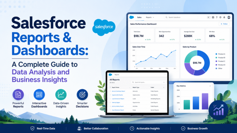
Salesforce Reports and Dashboards: A Complete Guide to Data Analysis and Business Insights
Businesses generate a huge amount of data every day. From

Who Will Become Apple’s New CEO After Tim Cook? | Current Affairs
A major leadership change at one of the world’s most

Which NASA Space Telescope Was Launched to Study Dark Energy, Dark Matter & Exoplanets?
A new milestone in space exploration! 🚀 NASA’s latest space